What is happening now?
Which consultations are in progress, which patients have checked in, and which doctors and rooms are available.
A daily workspace for clinic front desk staff to track appointments, delays, and doctor and room availability.

Appointments, doctors, and rooms affect one another throughout the day. These connections needed to be clear at a glance.
What information matters most
How appointments, doctors, and rooms connect
How statuses and delays work
Which actions are available at each stage
How to highlight situations that need attention
These three levels shaped the screen structure, information order, and visual hierarchy.
Which consultations are in progress, which patients have checked in, and which doctors and rooms are available.
Where a delay started, who it affects, and which patients have not checked in on time.
The action available for each appointment: check in the
patient, start the consultation,
or complete it.
The status shows where an appointment is in the flow and what front desk staff can do next. Each active appointment has one primary action.
A delay shows how far an appointment is behind schedule, what caused it, and which appointments it affects. The status still reflects the current stage.
The status shows the current stage. The delay explains what is affecting the appointment.
James Miller’s consultation is running over. Ava Johnson is
waiting for it to end,
while Emma Taylor has not checked in on
time.
 Ava Johnson

James Miller’s consultation is running longer than planned.
James Miller
Ava Johnson is checked in and waiting
for the previous consultation to end.
Confirm whether Emma has arrived
and update the appointment.
The daily appointment list takes up the main part of the screen. Doctor and room availability stays visible alongside it, making it easy to track the schedule, resources, and issues that need attention.
Hover to see each area in context
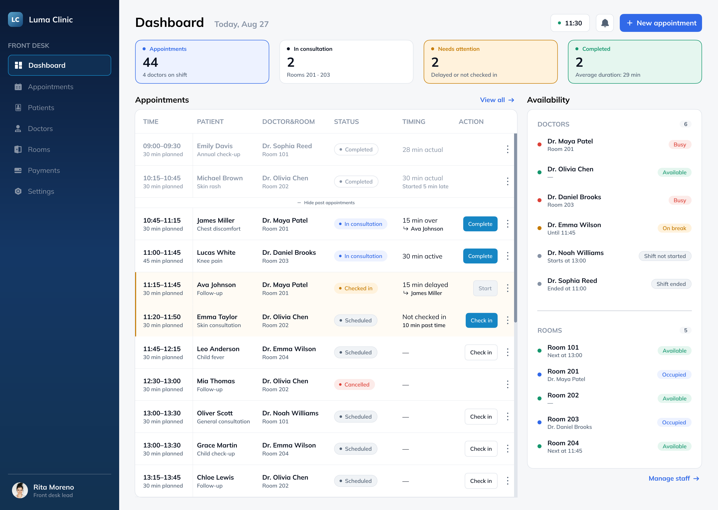 Daily appointments
Doctors and rooms
Current status
Next action
Secondary actions
Daily appointments
Doctors and rooms
Current status
Next action
Secondary actions
Daily appointments
Doctors and rooms
Current status
Next action
Secondary actions
Daily appointments
Doctors and rooms
Current status
Next action
Secondary actions
Some features need their own flows and more space. Keeping them off the main screen preserves a clear hierarchy and quick access to daily tasks.
These belong in a reporting section built for date ranges, comparisons, and trends.
These help users move between dates and browse
a larger appointment list. They fit better within
the Appointments section.
This would need its own rules for priority,
read states, and notification history.
Doctor shifts and room bookings belong in the Doctors and Rooms sections.
Reusable patterns keep statuses, actions, and resource availability consistent across the dashboard.
Ava Johnson
Variables, variants, and Auto Layout keep recurring states consistent across the screen.
The brief defined the core entities: appointments, patients, doctors, and rooms. The next step was to connect them: how a status determines the available action, how a delay affects the next appointment, and what context front desk staff need throughout the day.
These rules shaped the screen. The table keeps appointments together, the availability panel shows the current state of resources, and issues appear exactly where staff can act on them.
Website redesign for a private school that helps parents figure out if it's the right fit for their child.
View Case Study →